Google I/O is a unique conference where for three days you are exposed to the sun and fresh air and immersed in non-stop learning and inspiration. This year was my first Google I/O and in addition to attending technical sessions and 1:1 app reviews, everyone had the opportunity to talk directly with Google designers and engineers and plenty of possibilities to connect with other participants and to have fun in between.
I sketched a lot during most of the sessions. In this quick overview, I want to share with you my sketches from the talks and the summary of what I learned.
Hot stuff

There were several topics that drew my attention as a designer:
- Understanding conversational interfaces and the design process for voice-first applications.
- Assisting drivers. This topic overlaps with conversational interfaces and raises the issues of multimodal interactions.
- Web applications as an evolution of responsive sites and their role for first-time internet users.
Conversational interfaces
Shifting to a voice interaction model requires people to change already established habits around multi-touch interaction and most likely this will be neither an easy nor fast process.
However, there is no doubt that conversational interfaces will become the primary way for our interactions with online services in the future and it is a good time to start learning how such interfaces should be designed.
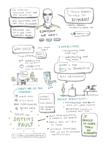
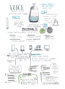
- Users’ memory span is very short—on average you are dealing with 5-9 word phrases. So avoid information overload and keep your assistant’s messages very short: structure information in a way that supports the recall, ask questions that are easy to answer, and break messages into two parts.
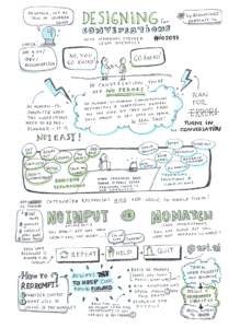
- People are experts in conversations (embrace this), which is why they have a very low tolerance for system errors. So ALL errors will be the system’s fault. Spend time developing a strategy for exceptions; make it easy for a user to get back on track; leverage techniques that we use in everyday conversations.
- The Google team is eager to feature your app for assistant and there are several criteria they are using, asking themselves: Did I smile? Did I LOL? Did I learn something? Will I use it again? Would I use it every day? Would I tell someone about it? Can I pick up where I left off? Did it do what I expected? On the other side: Was I confused at any point? Did I have to repeat myself? Did it have a nice re-prompt?
- There is two type of errors in human-to-computer voice interactions: no input (you didn’t get any input from the user) and no match (you got input but you were not prepared to handle it). You should consider users’ context and the sequence of the questions, think about why they didn’t respond, try another strategy or re-prompt: repeat the initial question. Each time you re-prompt look for opportunities to add variety and ask in a new way or escalate for details.
Google clearly wants to put Assistant into any device around you. At IO they showed open source projects with the Google Assistant SDK – DIY robotic cocktails mixer and the Do-it-yourself AI for Makers.
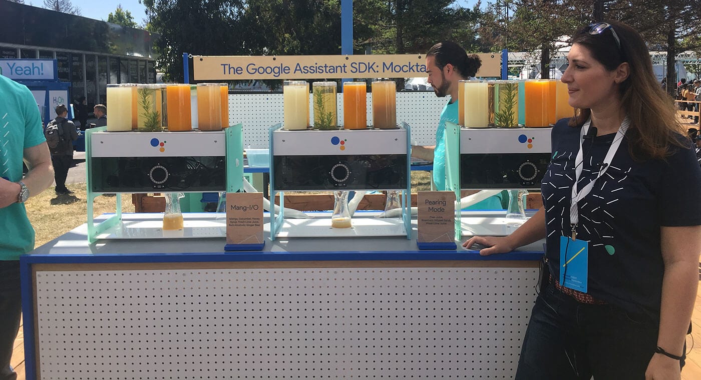
You can read Google’s guide on conversational UI here and check my sketch below. 😉
Sessions worth watching:
- Finding the Right Voice Interactions for your App
- In Conversation, There Are No Errors
- Home Automation with the Google Assistant
Join Google challenge and submit your app for assistant by August 31st!
Assisting drivers
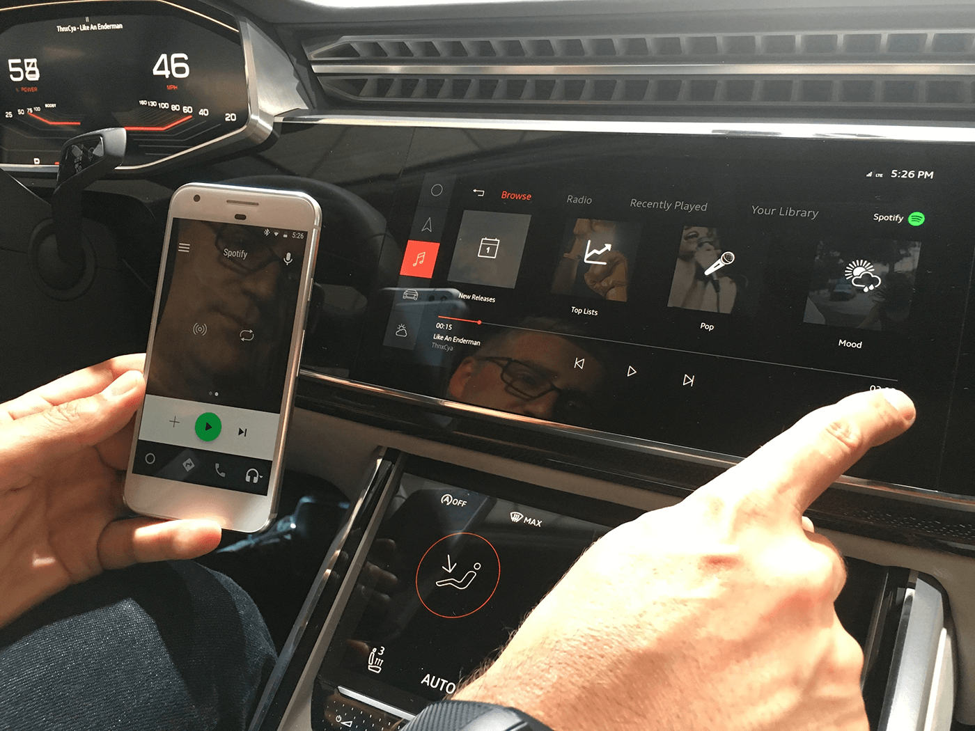
Android Auto now works right on your phone screen, or on your car display. At IO, Google presented two cars, Volvo and Audi, with Android Auto software onboard.
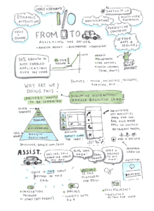
- Main principles to keep in mind when designing an app for cars: minimize distractions and reduce cognitive load.
- Google created a system that enables automotive use templates to safely and predictably perform the most common driving-related tasks. For example, if you are Spotify, you will create an API for Android Auto and OAM will be able to include it in the car, but you won’t control the look and feel of your app. This is really make sense – each time the driver switches between, let’s say, Spotify or SoundCloud, you don’t want them to have to learn a new interface.
- When building a product for various platforms and surfaces consider users’ interaction model (which input/output mode is the strongest: audio, video or haptic?) and the user conditions (Are they on the move? Are they in private or shared environment? Can they access the screen?). You should understand which mode is the strongest and optimize for it.
- Google wanted to show that Android in the car is a good way for application developers to deliver their content for drivers in the way they could not do before and that the car manufacturer (OAM) can bring really nice user interface and all the opportunities of the Android to the driver without compromising their brand identity: Android inside Audi will feel like Audi.
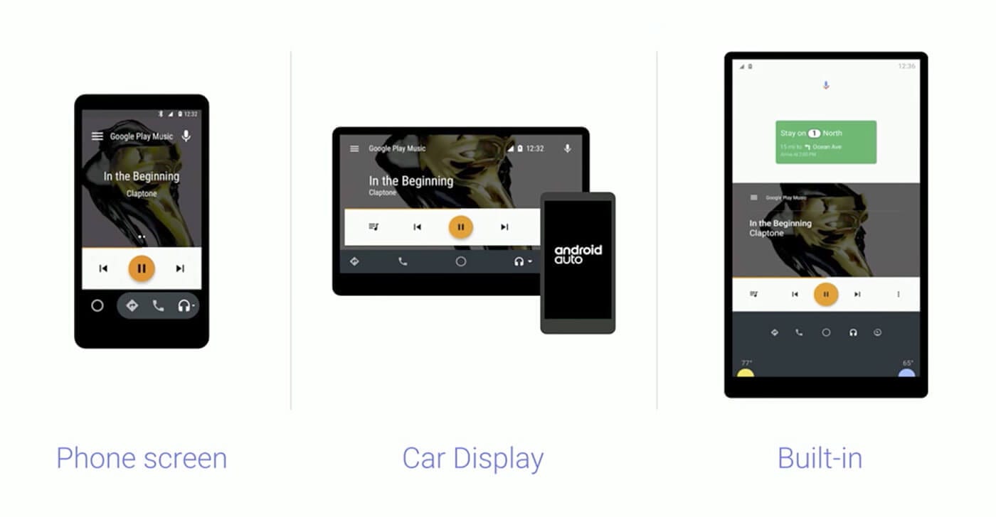
Sessions worth watching:
- Defining Multimodal Interactions: One Size Does Not Fit All
- Assisting the Driver: From Android Phones to Android Cars
Web applications as evolution of responsive sites
For the last 7-8 years I have been focused on designing for native mobile interactions and building web apps always was a compromise between quality, performance and app capabilities. You can create such a better user experience if you design a native app!
But it looks like things are changing. The web is becoming a platform for lightweight apps that can be accessed on-demand, installed without friction, and incrementally updated.
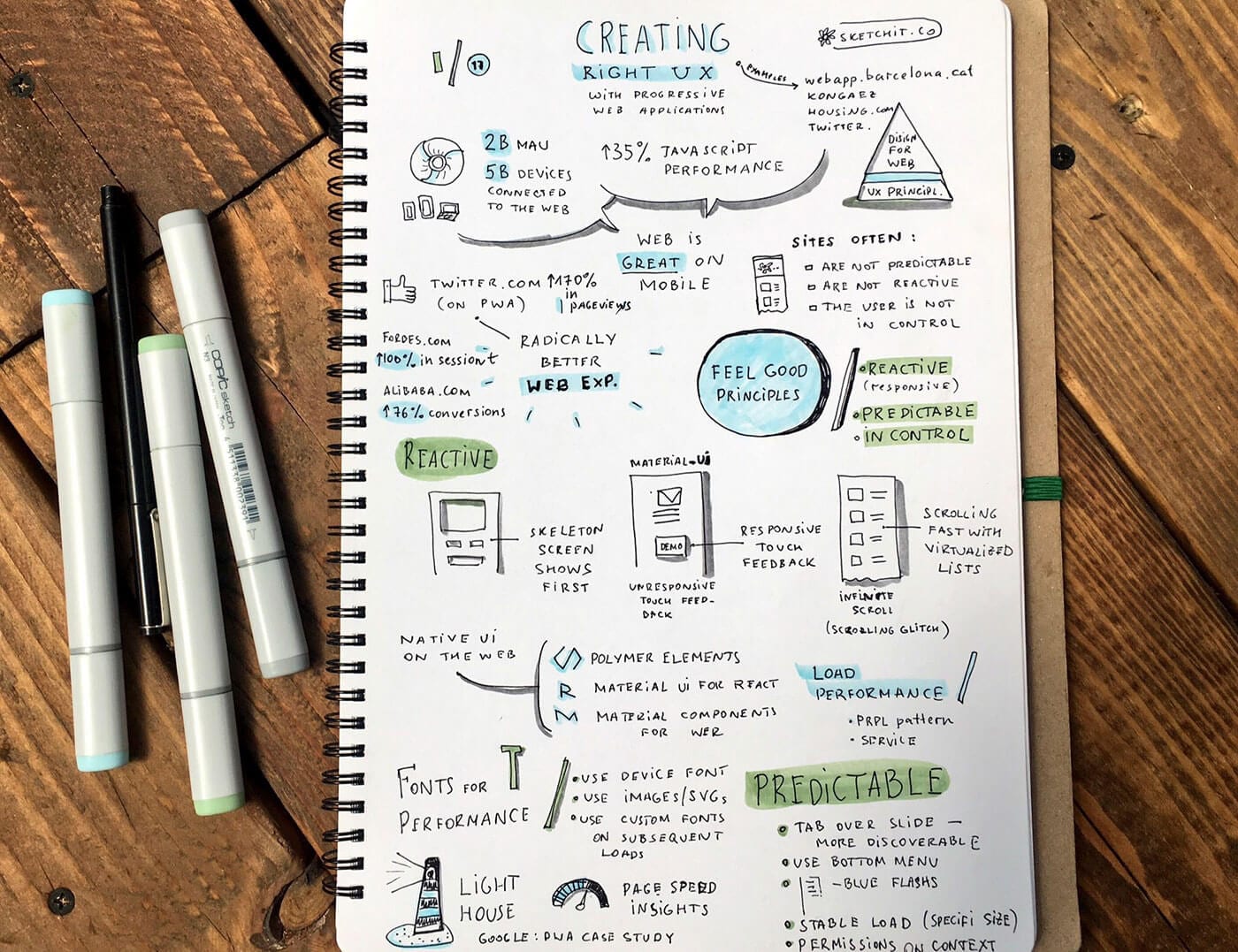
Progressive Web Apps (PWA) allows you to create a radically better web experience on mobile and in many cases it may be the only app you will build — for web, for iOS or for Android.
- PWA fits any form factor: desktop, mobile, tablet, or whatever is next;
- allows users to work offline or on low-quality networks;
- feels like an app;
- makes re-engagement easy through features like push notifications;
- allows users to add apps they find most useful to their home screen without the hassle of an app store.
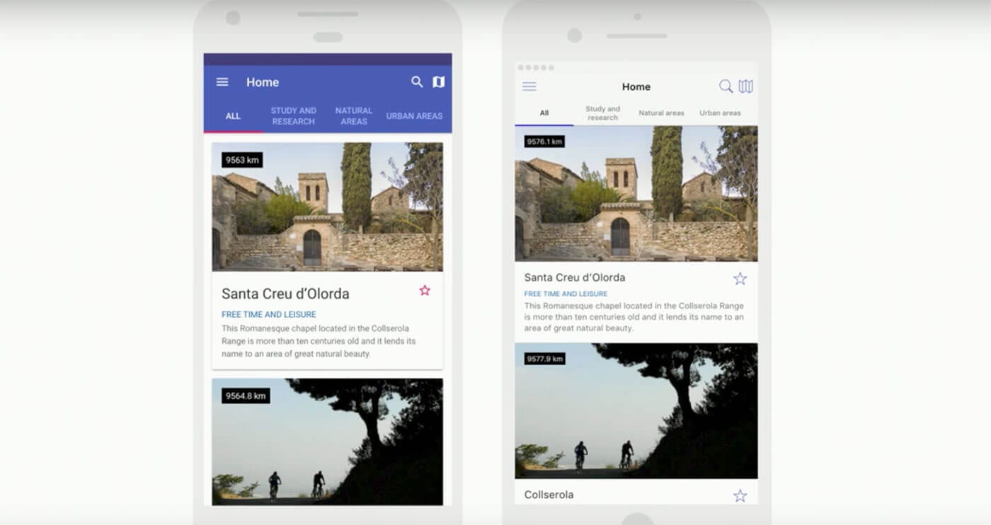
Several quick and quite impressive facts:
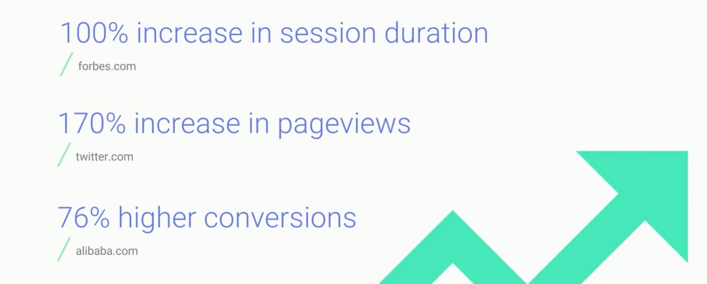
- Twitter. Mobile accounts for over 80% of Twitter’s usage, with many users reaching the site via 2G or 3G networks. With the launch of the new web app they reported a 65% increase in pages per session, 75% increase in Tweets sent and 20% decrease in bounce rate. The Twitter web app is fast and responsive, uses less data, takes up less storage space, and supports push notifications and offline use in modern browsers. Check case study here.
- Forbes reports a 100% increase in sessions on mobile since they launched mobile web app.
- Olacabs (leading cab aggregator in India, 1M rides every day) were able to reach new markets in the Tier 2-3 cities, where people use very basic Android smartphones and often don’t install apps at all. They achieved a 68% increase in mobile traffic in Tier 2 and 3 cities. Ola also noticed that 20% of users who book using their PWA had previously uninstalled their app. By reducing the amount of storage space needed, the PWA allowed them to effectively re-engage with their previous app users.
- Alibaba reports a 76% growth in conversion on the mobile web.
Sessions worth watching:
Designing for new internet users or the next billion users
Last year Google saw over 100 M new internet users come online in India but 65% of India’s population is not yet online. So, projecting forward, various experts suggest that by 2020 there will be about 1 billion unique mobile subscribers in India alone. And that is just in India. Google sees similar processes happening in countries like China, Brazil, Nigeria.
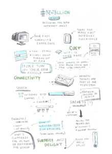
So all these people might be your new future users. And their first internet experiences are on mobile phones (not desktop), a lower-end device (limited storage, RAM, old OS) with a slow and pricey connection and rare WiFi access.
And even if you are not focused on reaching users from these emerging markets, by building products that are fast and use less data, you will delight your savvy internet users as well.
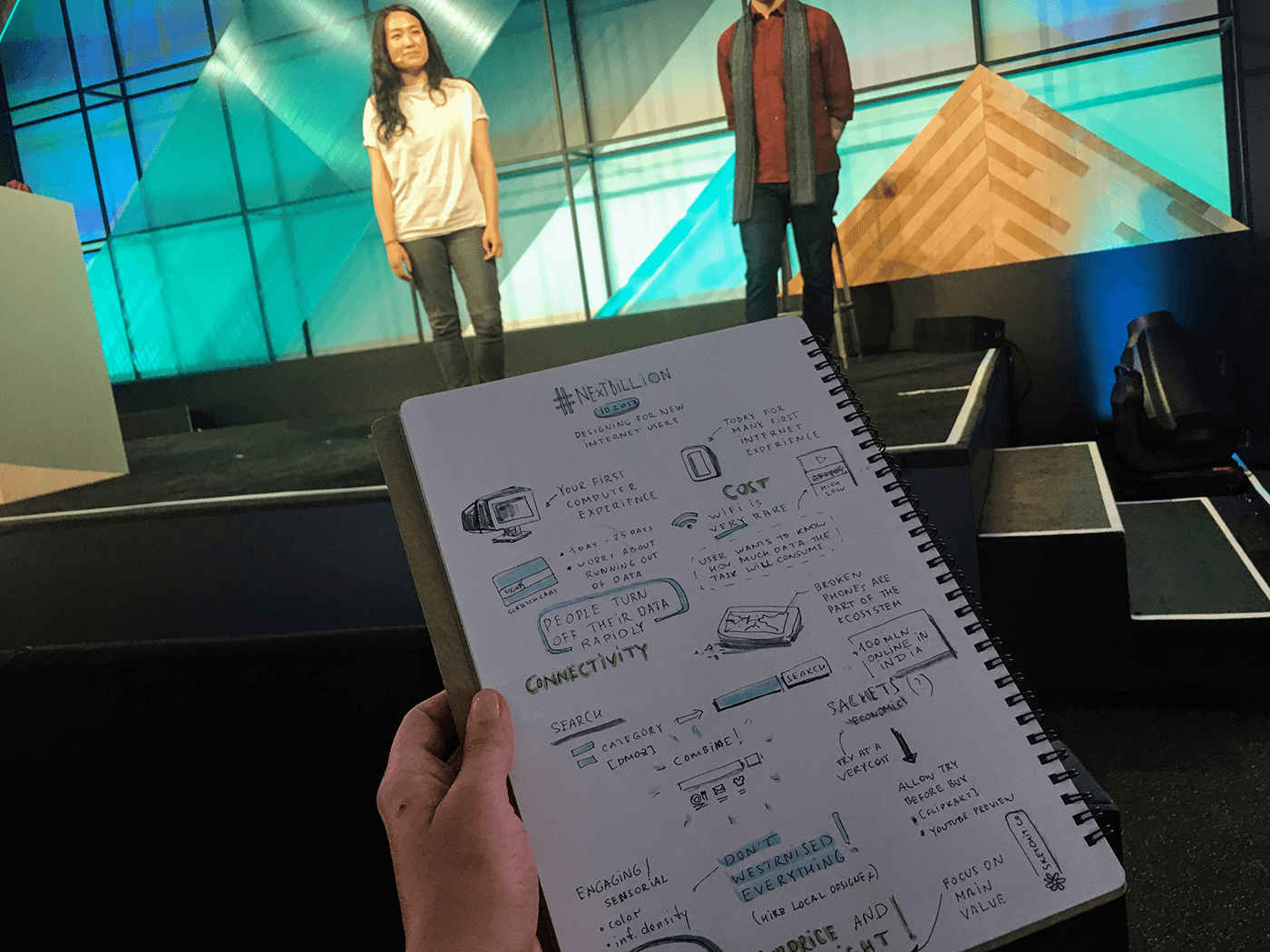
So new internet users are facing very different constraints when accessing the internet:
- 33% of smartphone users in India run out of storage space every day and 83% people delete stuff every week.
- 50% of the users in India and 2/3 in Nigeria have 2G connections, so a lot of them are not really connected all the time. If you are building a product that relies on constant updates, that is not going to work out for you—you need to make sure that your product is fully functioning offline.
- People buy prepaid packages of data (10 Mb or 100 Mb) and use them really consciously, often turning on and off Airplane mode, keeping track of which app is using up data and how much.
Therefore, when building the product for these new markets keep those things in mind.
- For data-heavy tasks provide transparency and control over data consumption (ex.: give the option to preview the content before it is loaded).
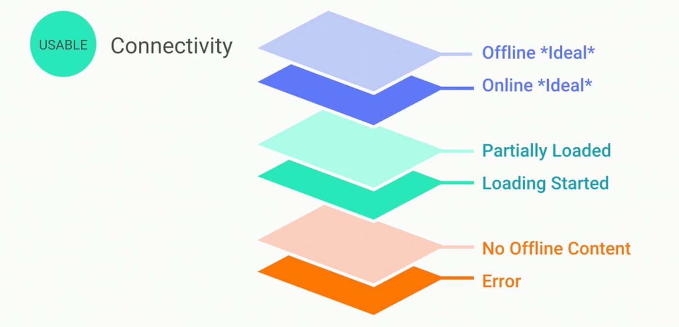
- Make great connectivity the edge case. Expect latency and allow offline mode (optimize for bandwidth constraints and inconsistent connectivity).
- Design clearer, larger, farther-apart affordances to prevent mistaken taps caused by bad or broken screens.
Sessions worth watching:
- Designing Great Apps for New Internet Users
- Building for Your Next Billion Users
- Designing for the Next Billion Users: Accessibility UX Insights from the Developing World


